
Volunteer application forms are a critical gateway between interested supporters and active volunteers. Even small improvements in form completion can significantly boost a nonprofit’s volunteer base. Many programs see only 15–20% of interested applicants actually becoming volunteers, yet some organizations achieve conversion rates of 30% or higher (rosterfy.com, 2025). Optimizing the form and its process is thus essential to turn more interest into action. This report compiles expert insights, psychological principles, case studies, and data-backed strategies to help nonprofits fine-tune their volunteer application forms. Each section concludes with practical takeaways for improving conversion.
expert advice
CRO for Volunteer Applications
Creating a seamless and engaging volunteer application process is essential for attracting and retaining committed volunteers. From the moment someone visits your site to the final onboarding step, every stage of the journey matters. By analyzing where potential volunteers drop off, streamlining follow-ups, and designing user-friendly forms, you can transform interest into action. The following insights and strategies will help you refine your approach, ensuring a smoother experience for both applicants and your team.
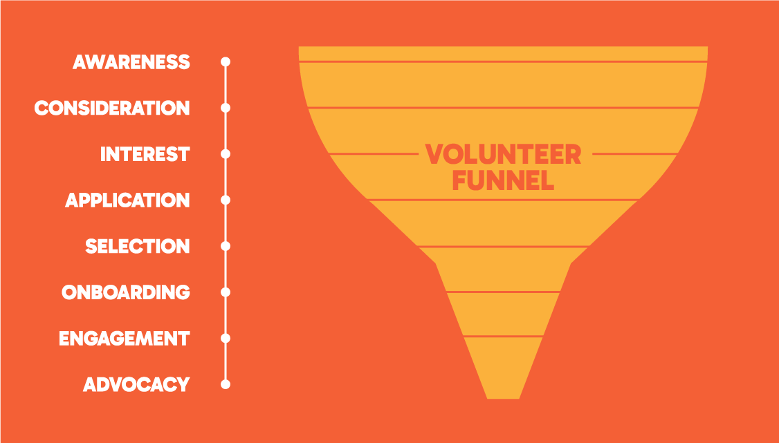
Analyzing the Volunteer Funnel
Experts recommend examining the entire volunteer application funnel – from site visit to onboarding – to identify where drop-offs occur. Use analytics to pinpoint problem areas, such as form submission or interview scheduling, and address specific choke points. For example, if many start the form but don’t finish, it may need simplification.

Diagnosing Problem Areas
Volunteer management consultant Tobi Johnson suggests collecting data to understand “what’s working and what’s not.” Tools like analytics or reporting can help identify stages with high abandonment, allowing you to focus on fixing specific issues that hinder volunteer progress.
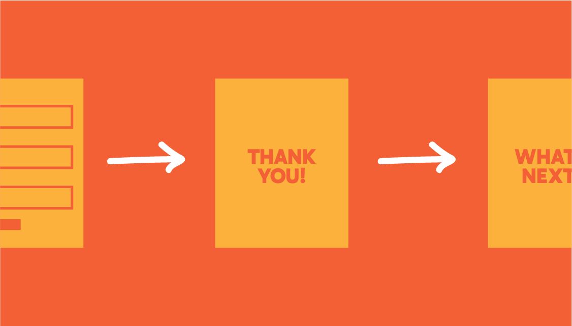
Streamlining Response and Follow-Up
Conversion optimization doesn’t stop at form submission. A common mistake is failing to follow up promptly, which can lose goodwill. Respond to applications within one business day, even with an automated “Thank you – here’s what happens next” email, to maintain enthusiasm and build trust.
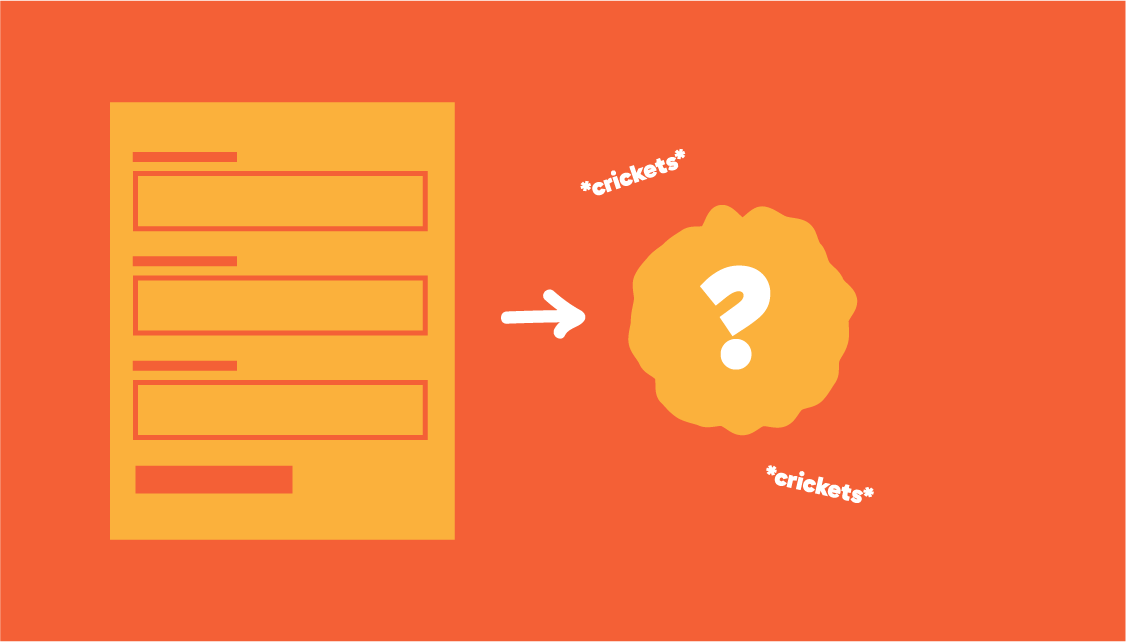
Avoiding the Black Hole Effect
Many volunteers report submitting applications and never hearing back – a surefire way to lose them. Quick, personal follow-ups capitalize on their initial interest. As Tobi Johnson says, “Nobody in this world is going to wait more than one business day.”

User-Centric Form Design
Treat the volunteer sign-up process like a customer journey. Ensure the form is easy to find, mobile-friendly, and intuitive. Break lengthy forms into stages, clearly indicate progress, and remove barriers like unclear questions or slow page loads to improve conversion rates.
getting theoretical
Psychological Principles Influencing Form Completion
Optimizing forms isn’t just about fields and buttons – it’s about human psychology. Several key principles can make the difference between an abandoned form and a completed application:
Cognitive Load & Simplification
Every additional question or step increases the mental effort (cognitive load) on the volunteer. When confronted with a form that “looked like a tax return” – long and daunting – users feel overwhelmed and are likely to abandon it. In fact, cognitive overload is cited as a primary reason for form drop-offs. The antidote is simplifying the experience.
Techniques like progressive disclosure (showing only a few questions at a time or only what’s relevant) help avoid overload. One digital agency found that by breaking a lengthy form into three short steps, they dramatically increased completions without removing any questions. The first impression should be that the form is doable and not a marathon.
Commitment Bias (Foot-in-the-Door Effect)
People tend to continue something they’ve started, especially if they’ve invested effort. Multi-step forms leverage this commitment bias by securing a small initial “yes” and then asking for a bit more. The endowed progress effect is a related bias: once users feel they’ve made progress toward a goal, they become more committed to finishing.
Showing a progress indicator or steps (“Step 1 of 3, 50% complete”) reinforces this. Studies show forms with progress bars have higher completion rates, especially for longer processes. Also, begin with a few easy, non-intrusive questions (name, email) to build momentum before asking for more personal or time-consuming details. This way, by the time volunteers encounter a detailed section (like availability or essay questions), they’re already invested in finishing.
Trust and Assurance
Trust is a huge factor in whether someone feels comfortable providing information. Users often abandon forms if they don’t trust how their data will be used. Establish credibility and safety visually and verbally. For example, include a brief privacy statement or a note like “We will never share your information” near fields asking for contact info.
If you require sensitive info (like a birthdate or ID for a background check), explain why and how it’s protected. Trust signals such as recognized security badges (SSL locks, Norton/MCAfee seals for web security), logos of well-known partner organizations, or even a testimonial from a current volunteer can reassure applicants. Think of it as answering the unspoken question in a user’s mind: “Is it safe and worthwhile to give my info and time here?” A professional-looking form design also matters; a polished, error-free interface implicitly tells users the organization is legitimate and cares about quality.
Social Proof & Motivation
Tied to trust is the idea of social proof – people are influenced by what others have done. Incorporating subtle social proof can boost form completion. For instance, a line of text could mention “Join 150 fellow volunteers in making a difference” or display a recent volunteer success story. Seeing that others have successfully gone through this process reduces uncertainty. Psychologically, it leverages the principle of social norms: if many people volunteer here, it must be a worthwhile experience. Just ensure any such messages are genuine and not overbearing.
By applying these psychological principles, you make the form feel easy, encouraging, and safe. Reducing perceived effort, tapping into commitment, and building trust will naturally lift your completion rates.
Keep the form’s cognitive load low (short and simple is best). Use multi-step flows and progress indicators to leverage commitment biases and give a sense of advancement. Build trust at critical points with privacy assurances, security badges, and social proof. Start with easy questions to let momentum and commitment carry volunteers through to completion.
case studies
Nonprofits Boosting Volunteer Sign‑Ups
Real-world examples illustrate how optimizing volunteer applications can yield significant gains:
onboarding re-org
Literacy Pirates (London)
This children’s literacy nonprofit had a thorough volunteer onboarding process involving multiple training sessions, screenings, and interviews. Initially, only around 10% of those who started the application went on to become active volunteers. By analyzing their funnel, the team made one key change: they moved most of the heavy onboarding steps to later in the process and put the mission first. In practice, this meant the initial application became simpler and more inspiring – highlighting their mission of helping kids read – while background checks and training were postponed until after an applicant was more committed. The result was dramatic – conversion jumped to over 30% of applicants becoming volunteers.
Despite still requiring training and checks, placing those later (after an initial sign-up and orientation) kept early interest high and minimized initial drop-off. This case underlines the value of reordering steps: hook volunteers with motivation up front, then tackle requirements once they’re engaged.
Shaving it down
Big Brothers Big Sisters Lone Star
his Texas mentoring nonprofit found that many prospective volunteers began their lengthy application form but didn’t finish it in one sitting. Their solution was to implement a “save and resume” feature on the multi-page form. This allows volunteers to create an account or save a link to return later without losing progress. By giving busy people flexibility to pause and continue, BBBS removed a major barrier to completion. Volunteers no longer had to start over if interrupted, and fewer forms were abandoned midway. While exact numbers weren’t published, this best practice is known to keep completion rates higher for long forms – especially when volunteers may need time to gather references or think about their availability.
Technology and UX Boosts
London Youth Games
Organizations that invest in volunteer management technology often see improved sign-ups. For instance, London Youth Games created a branded online portal for volunteer opportunities (via Rosterfy) and made it mobile-friendly. Volunteers can browse roles and apply with a single click in an app. Removing friction in this way – no cumbersome PDF downloads or email back-and-forth – led to more youth signing up quickly (exact figures aside, the adoption of such portals speaks to their effectiveness). Similarly, when XYZ Nonprofit switched from paper forms and spreadsheets to an online platform, they reported an increase in volunteer sign-ups thanks to the streamlined registration and better communication (e.g., automatic reminders). The case studies consistently show that user-friendly design, whether via form redesign or specialized software, translates to more completed applications and engaged volunteers.
quick tips
Data-Driven Best Practices for Volunteer Forms
Going beyond common sense advice (“make it short, make it pretty”), research and testing reveal specific best practices to optimize volunteer forms:
Eliminate Unnecessary Fields
Each extra field reduces completion rates. For example, removing a single optional field increased conversions by 50% in one study. Only ask for essential information at each stage (e.g., name and contact info first, save details like t-shirt size for later). Audit your form to ensure every field serves a clear purpose.
Use Multi-Step Forms
Break long forms into smaller steps to reduce intimidation. Multi-step forms consistently outperform single-page forms, with one test showing a 214% increase in leads. Start with easy questions to build momentum and use progress bars to keep users motivated.
Leverage Conditional Logic
Show only relevant questions based on prior answers. For example, hide follow-ups about past volunteering if the user hasn’t volunteered before. Tailoring the form to each applicant reduces noise and improves completion rates.
Minimize Open-Ended Questions
Replace essay-style questions with checkboxes or multiple-choice options. Open-ended fields slow users down and can feel daunting. Save detailed questions for later stages or interviews.
Optimize for Mobile
Ensure forms are mobile-friendly with large buttons, single-column layouts, and minimal typing. Use mobile-specific input types (e.g., numeric keypads) and test forms on various devices to avoid drop-offs.
Provide Save/Resume Options
Allow users to save progress and return later, especially for lengthy forms. Features like “Save and continue later” links or auto-draft saving improve completion rates and show respect for users’ time.
Implement Real-Time Validation
Use inline validation to catch errors as users type, reducing frustration. For example, flag invalid emails immediately. Clear, specific error messages near the affected fields help users correct mistakes quickly.
Offer Social Login or Prefill Options
Allow users to auto-fill forms with social logins (e.g., Google, Facebook) or pre-fill fields for returning volunteers. These features reduce repetitive tasks and increase conversions.
Incorporate Motivational Microcopy
Add encouraging text to keep users engaged, such as “You’re one step away from making a difference!” or “This only takes 5 minutes.” Reinforce the value of completing the form to boost motivation.
Engaging Volunteers
Speak to Their Motivations and Hook Their Hearts
To attract and retain volunteers, it’s essential to align your approach with their motivations and create an emotional connection from the start. Marketing experts often emphasize “language-market fit,” which means tailoring your wording to resonate with your audience’s values. In the volunteer context, this involves understanding why people sign up. Are they looking to build skills, make friends, or support a cause they deeply care about? Reflect these motivators in your form’s language. For instance, instead of a generic header like “Volunteer Application,” try something more engaging, such as “Join Our Fight Against Hunger – Volunteer Sign-Up.” If younger volunteers value community service hours or networking, highlight those benefits. Gathering feedback or using surveys can help identify the phrases that resonate most with your audience, allowing you to weave them into your forms and introductions. This alignment can significantly boost engagement—some experts even call it a game-changer.
Equally important is how you onboard volunteers. A “mission-first” approach can make a powerful difference. Instead of starting with tedious paperwork or training, immerse volunteers in your mission and community right away. For example, Literacy Pirates flipped the traditional process by beginning with an inspiring introduction and moving logistical requirements to the end, resulting in a threefold increase in conversions. The key is to hook the heart first and handle the logistics later. Consider making your initial sign-up an “interest form” that’s short, motivational, and low-commitment. Once volunteers feel emotionally connected and have mentally committed, you can follow up with more detailed requirements like background checks or waivers. This approach leverages psychological momentum, making it easier for volunteers to follow through and stay engaged.
they said yes!
Leverage Commitment with Small “Pre-Commitments”
Another creative approach is to incorporate micro-commitments before the main application. For instance, some nonprofits use a pledge or quiz that precedes the application. A simple example: a pop-up asks “Do you care about clean water? Become a volunteer in 5 minutes!” with a Yes/No choice. If they click yes, they’re mentally agreeing to the cause, and then are taken to the form which capitalizes on that momentum. This two-step approach (interest confirmation -> actual form) is essentially a foot-in-the-door technique. It’s not suitable for everyone, but it can be effective if done sincerely. Even something like an RSVP to an info session or an email list sign-up can act as a warm-up, after which completing the volunteer application feels like a natural next step rather than a cold start.
take action now
Create Volunteer Forms That Convert
Optimizing your volunteer application process is about balancing simplicity, trust, and inspiration. Here’s how to take action today:
By combining these strategies, you’ll create a volunteer application experience that’s efficient, inspiring, and welcoming—turning “I’d like to help” into “I’m ready to serve.” Start refining your forms today and watch your volunteer base grow!
Keep in Mind:
The Importance of Regular Updates
Keeping volunteers informed and up-to-date with the organization’s progress is critical to maintaining their engagemen
Clearly define volunteer roles.
Ensure they understand their responsibilities and how they contribute to the mission.
Choose the Right VMS Platform for Your Needs.
Not all volunteer management systems are the same. Research and select one that aligns with your organization’s goals and capacity